As October settles over the landscape, it brings with it a certain kind of magic. The air grows crisper, the light softens to a golden glow, and the world seems to wrap itself in a quieter, more romantic mood. It’s no wonder that nature becomes the ultimate muse for couples marrying during this enchanting season.
Yet for October 2025, we are seeing a beautiful evolution in autumn wedding aesthetics. Discerning couples are moving beyond the predictable script of burgundy and rust, seeking palettes that feel more personal, modern, and masterfully curated. Think less of convention and more of a deeply evocative mood board: the sun-baked warmth of terracotta, the quiet depth of mossy green, the unexpected romance of digital lavender, and the soft glow of buttercream.
Your wedding palette, after all, is more than just a visual backdrop. It is the emotional thread that weaves every detail together, from the first glimpse of your invitations to the final toast of the night. It tells your story without saying a word. To inspire your celebration, we present five of the most captivating colour palettes for the season, each one designed to give your day a timeless, unforgettable glow.
Five Curated Palettes for the Modern Autumn Wedding
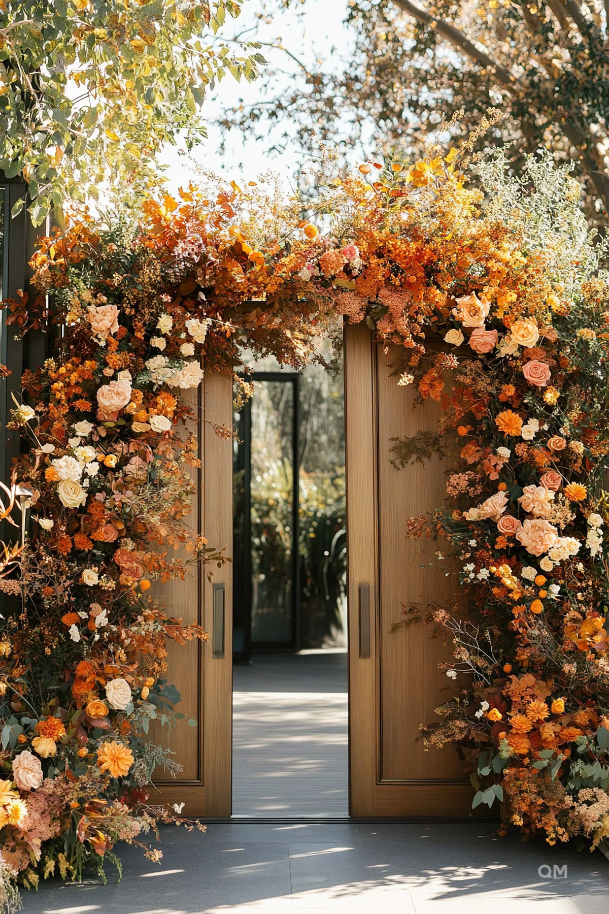
1. Terracotta, Toffee & Dusty Rose
The Vibe: Earthy warmth meets windswept romance. This palette feels like a golden hour sunset stretching over a desert landscape. It’s warm, sophisticated, and effortlessly chic, perfect for a couple that is both grounded and adventurous.
How to Use It: Envision bridesmaids in flowing toffee-coloured dresses, carrying bouquets of dried grasses and dusty rose florals. For tablescapes, use raw linen tablecloths, terracotta-hued charger plates, and delicate gold cutlery. Your stationery can feature elegant, minimalist typography on warm, textured paper. This palette thrives on texture and natural materials.
2. Moss Green, Modern Cream & Gold
The Vibe: Timeless elegance with an organic soul. This combination is a nod to the enduring beauty of a forest floor, elevated with a touch of quiet luxury. It’s for the classic couple who wants their celebration to feel both natural and incredibly refined.
How to Use It: Set the stage with rich, moss-green velvet linens or accent chairs. Keep florals clean and architectural with modern cream blooms like orchids and calla lilies, accented with deep green foliage. For attire, a groom in a deep green suit is a stunning modern choice. Gilded details, from stationery foil to candle holders will provide that perfect touch of warmth and light.
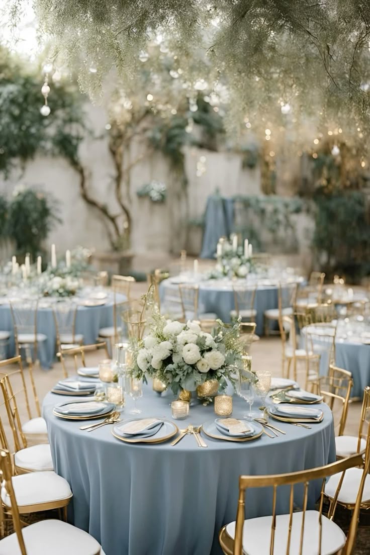
3. Blackberry, Slate Blue & Polished Silver
The Vibe: Moody, celestial, and unapologetically romantic. This palette is for the couple who isn’t afraid of drama. It evokes the feeling of a crisp, starry autumn night, full of depth and mystery. It is daring, sophisticated, and utterly unforgettable.
How to Use It: This palette shines in evening celebrations. Use slate blue as your foundational neutral for linens and stationery. Introduce blackberry through lush, overflowing floral arrangements, groomsmen’s accessories, and signature cocktails. Polished silver accents on glassware, charger plates, and jewelry will cut through the moodiness, adding a touch of modern, reflective light.
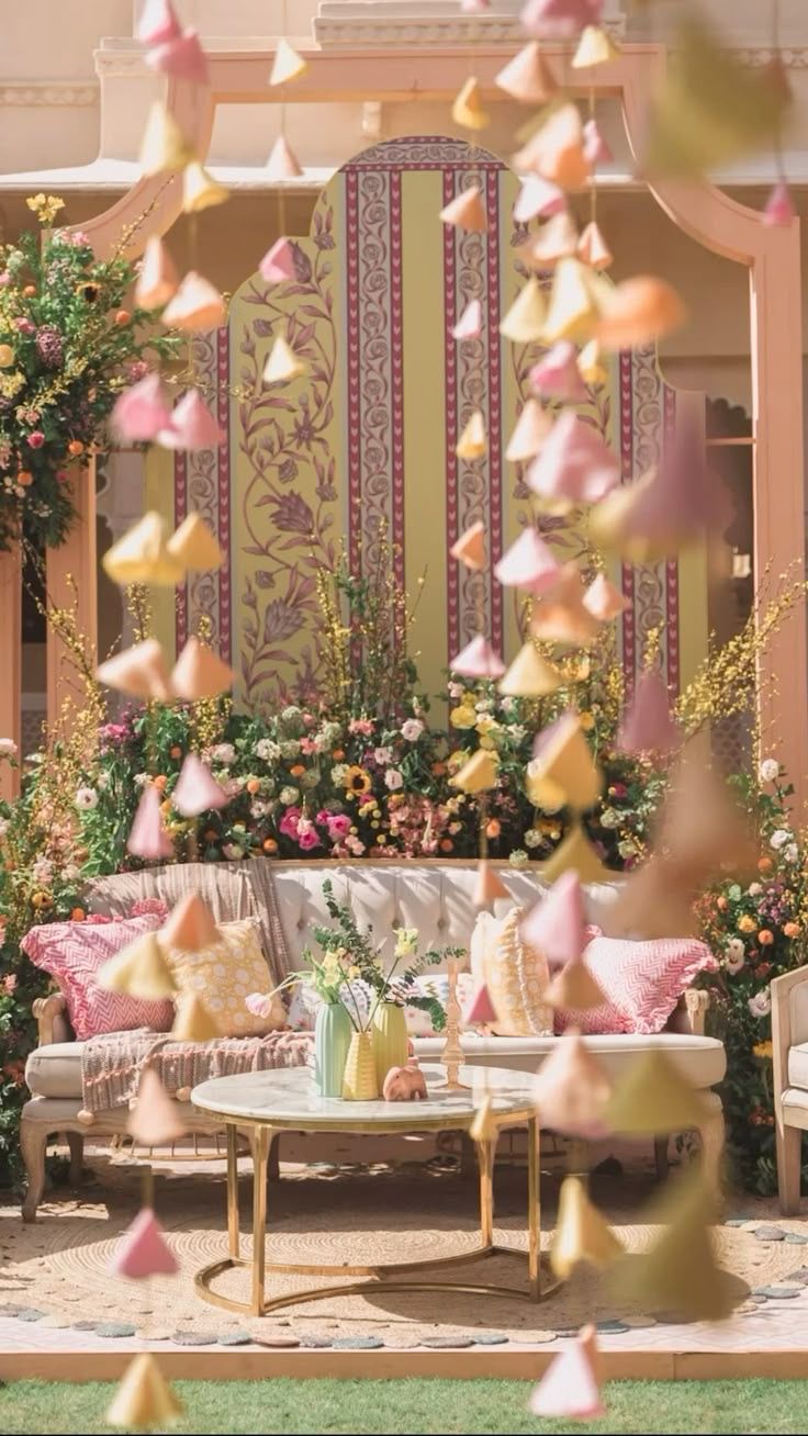
4. Buttercream, Champagne & Muted Sage
The Vibe: Understated, ethereal, and airy. For the minimalist couple, this palette proves that autumn doesn’t have to be dark. It captures the soft, hazy light of a cool October morning, feeling gentle, intentional, and incredibly chic.
How to Use It: Layering is key. Use buttercream and champagne as your primary tones across fabrics, florals, and paper goods to create a soft, tonal look. Introduce muted sage green through delicate foliage like eucalyptus or olive branches. This palette works beautifully with natural light, making it perfect for a daytime ceremony or a reception in a gallery-style space with large windows.
5. Digital Lavender & Muted Teal
The Vibe: Artistic, fashion-forward, and creatively bold. This unexpected pairing is for the true originals. It blends a soft, digital-inspired pastel with a rich, earthy jewel tone, creating a dynamic contrast that feels both modern and deeply stylish.
How to Use It: Use these colours as intentional statements. A pop of digital lavender in the floral arrangements against the backdrop of muted teal bridesmaid dresses creates a stunning visual. For stationery, consider a modern colour-blocking design. This palette is perfect for a contemporary city wedding in a loft or art gallery, where the colours can stand out as artistic expressions.
Conclusion
Ultimately, the perfect October colour palette is not about following a trend; it’s about finding the combination of hues that feels like a true extension of your own story. Whether you are drawn to the earthy warmth of terracotta or the moody romance of blackberry, let your colour story be the beautiful, cohesive thread that makes your celebration entirely and unforgettable yours.